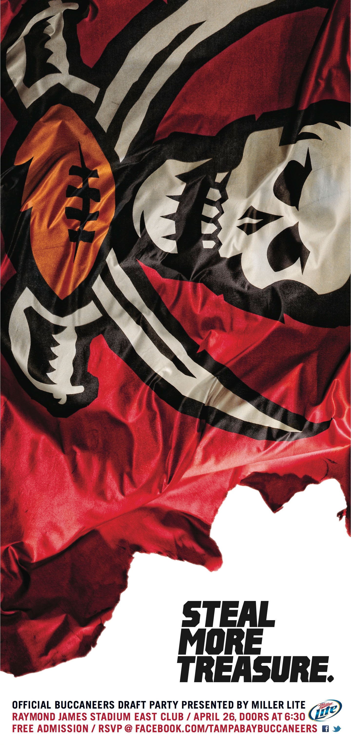
The Buccaneers came into their 2012 season with a new coach, a great draft pick and tons of optimism. We needed to translate the energy into fan engagement so we completely overhauled the brand and created a rallying cry for all of Tampa that revolved around the flag.
The Buccaneers came into their 2012 season with a new coach, a great draft pick and tons of optimism. We needed to translate the energy into fan engagement so we completely overhauled the brand and created a rallying cry for all of Tampa that revolved around the flag.
︎
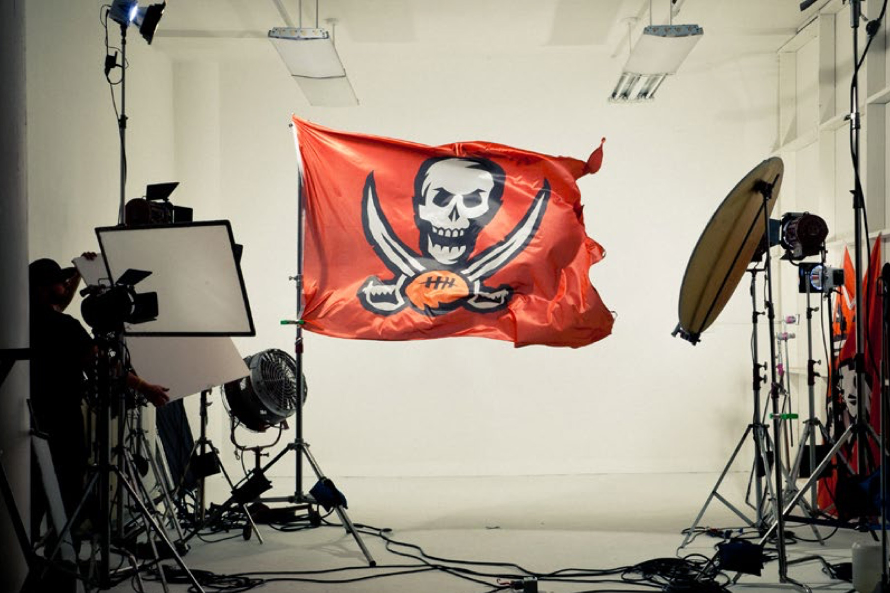
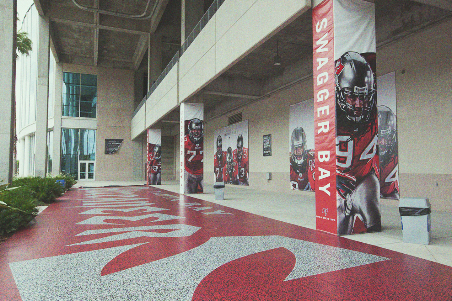
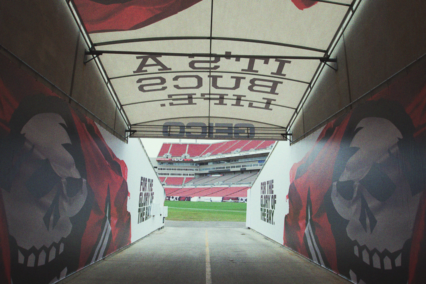
There’s not many brands with a logo as beautiful and dynamic as a flowing pirate flag. It was an easy choice focus the entire brand around photography of the flag itself.
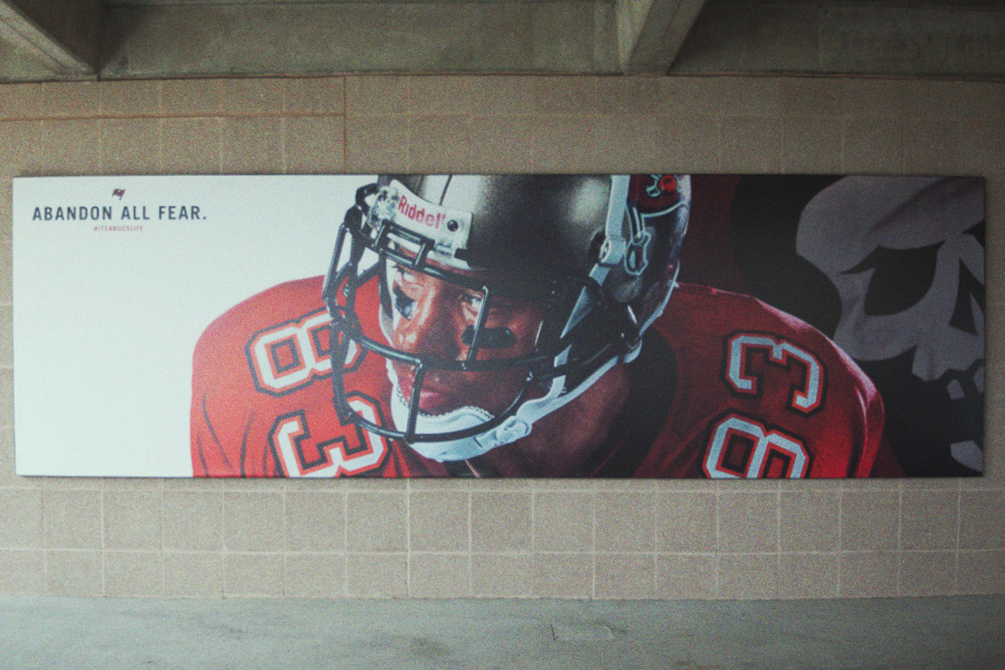
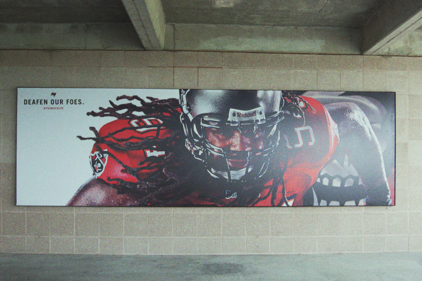
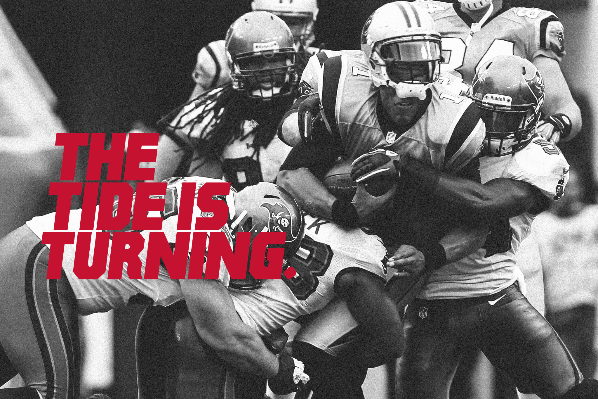
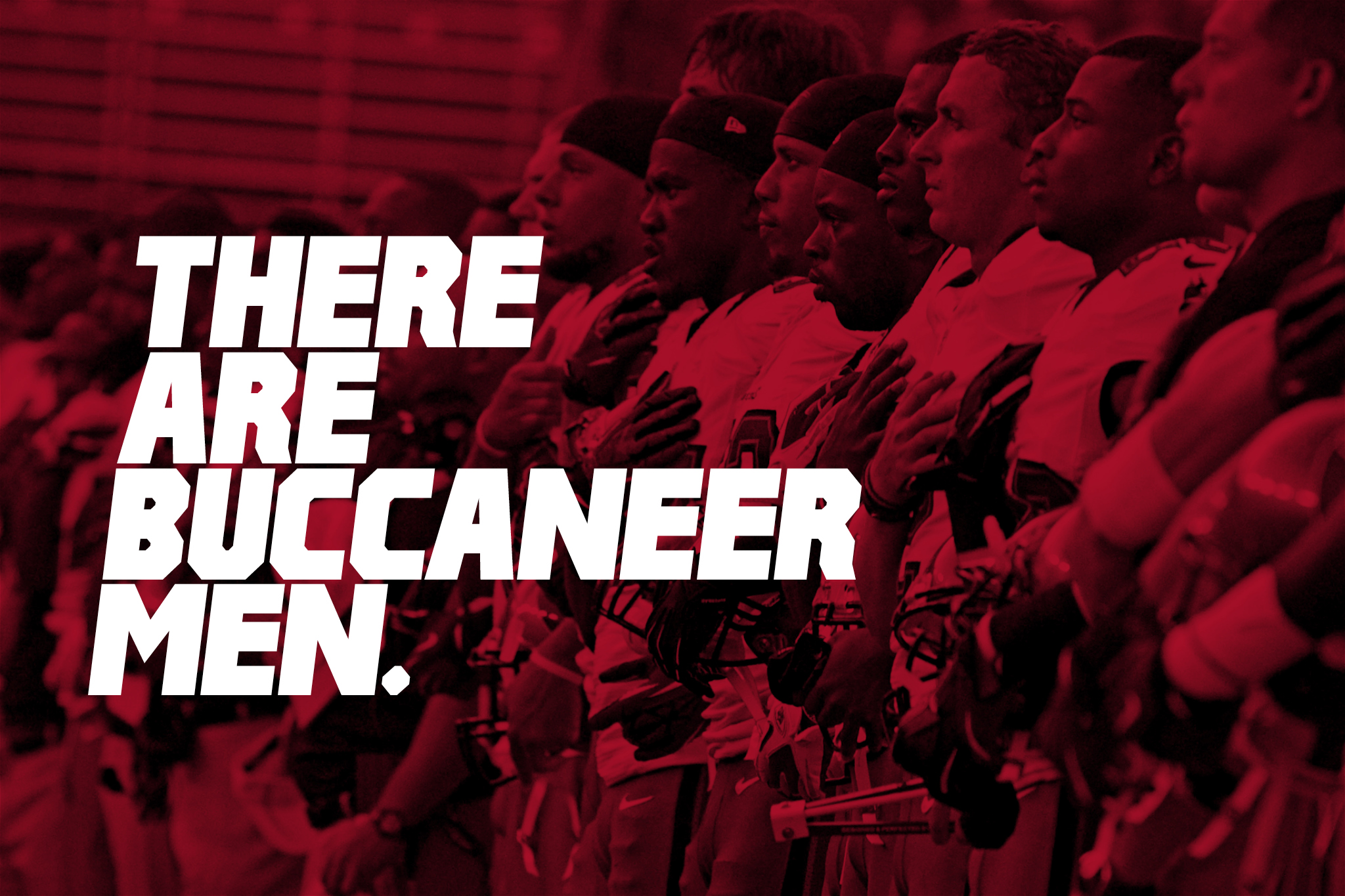
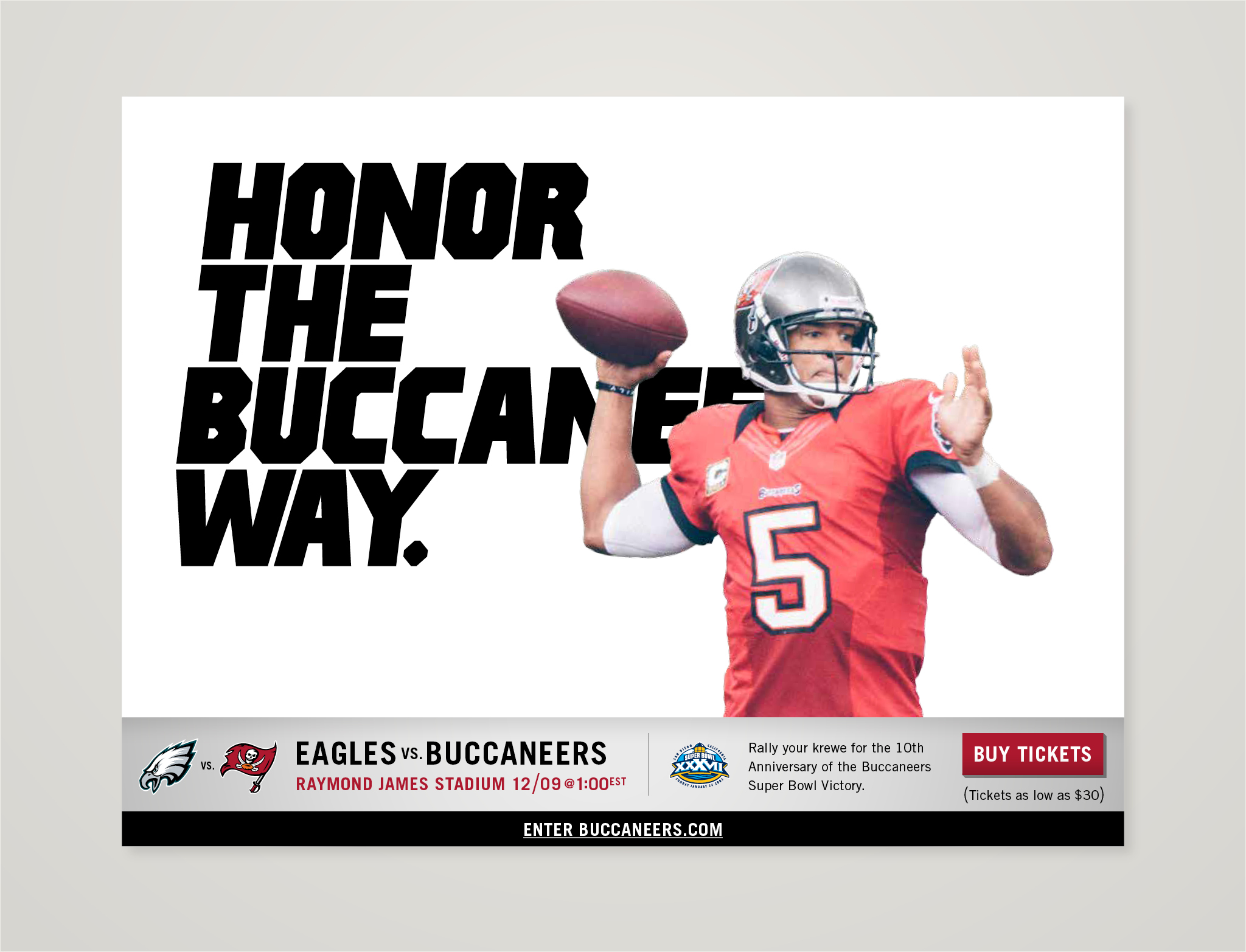
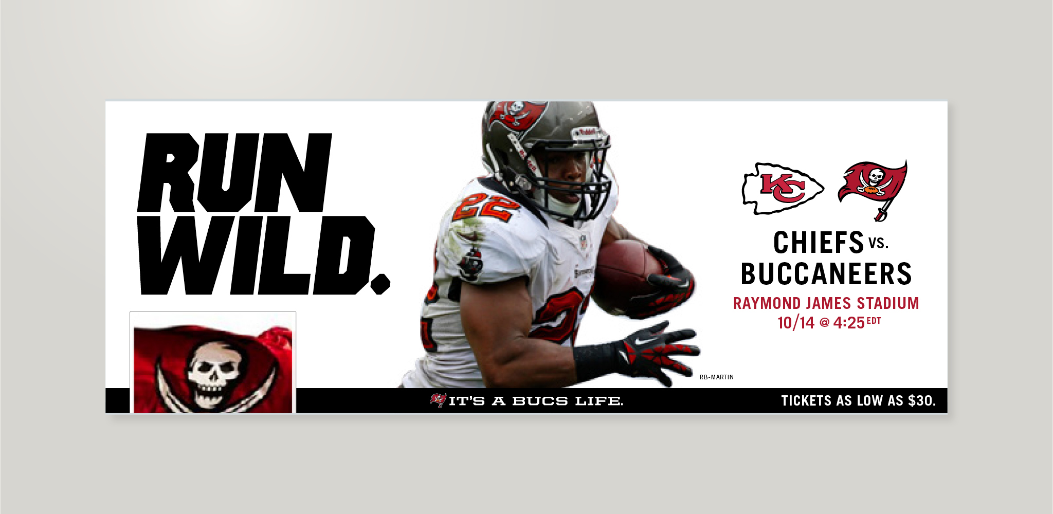
We gave the Bucs a modern and strong look, built with dramatic flag images, aggressive athelete photography, bold use of type and luxurious negative space.
We gave the Bucs a modern and strong look, built with dramatic flag images, aggressive athelete photography, bold use of type and luxurious negative space.

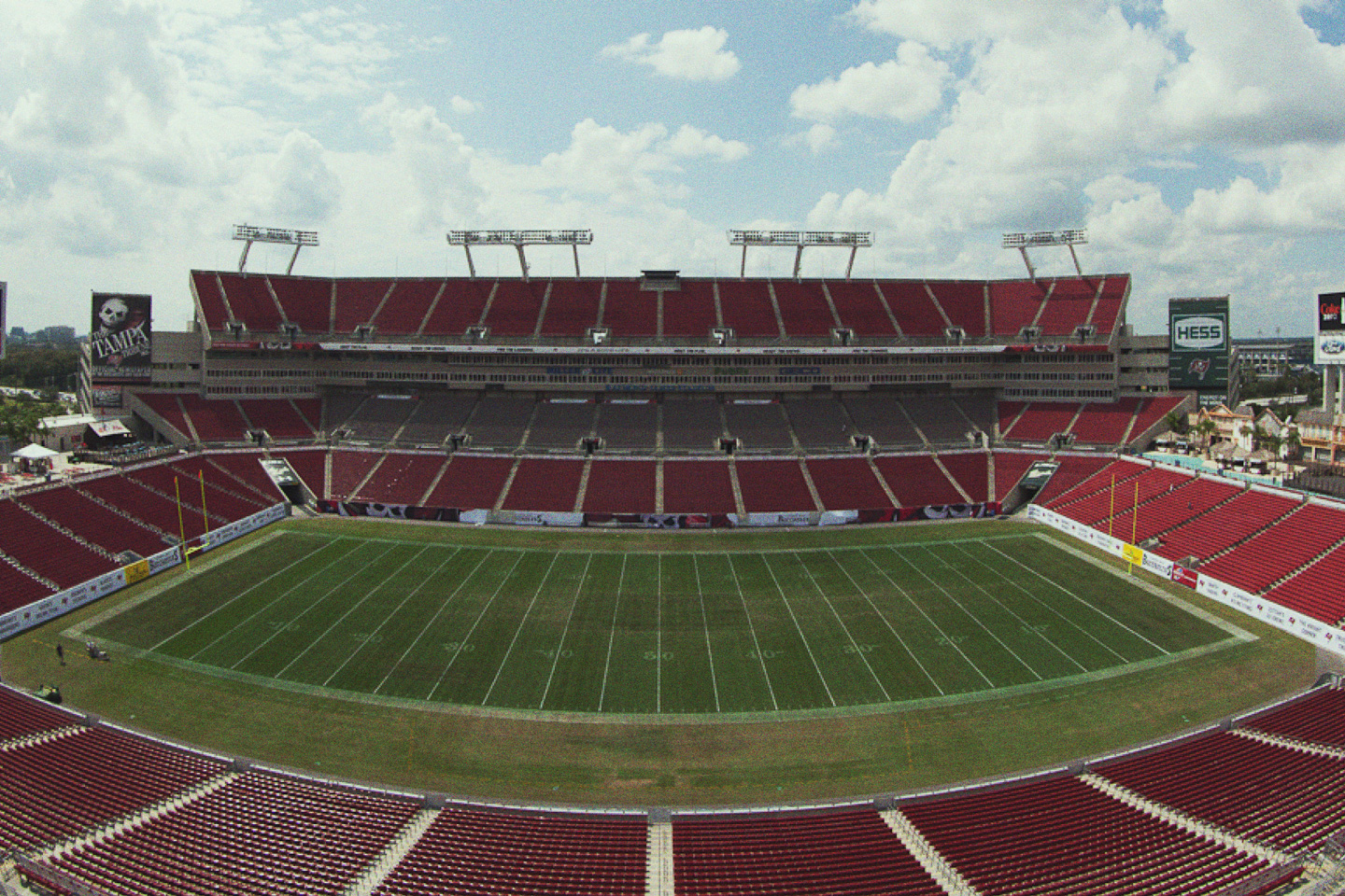
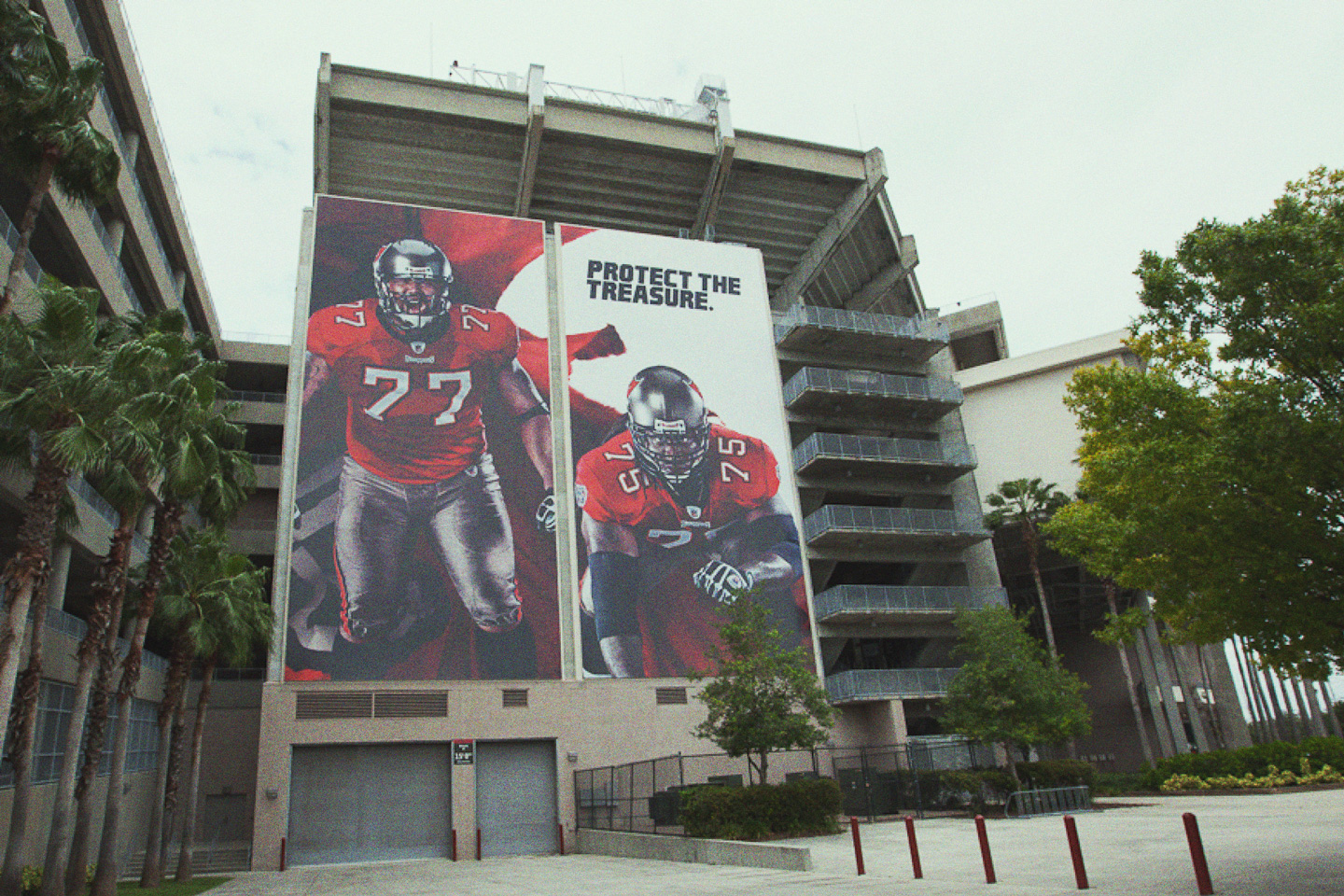
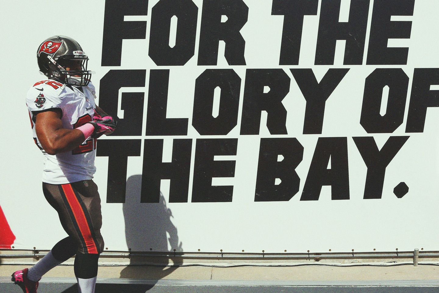
The stadium got a total make over, with more than a thousand unique designs en masse. We did it all: the 170 foot tall posters on the exterior, all the stadium wayfinding / signage, and even the Buccanners branded ketchup dispensers.
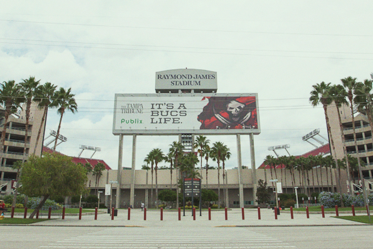

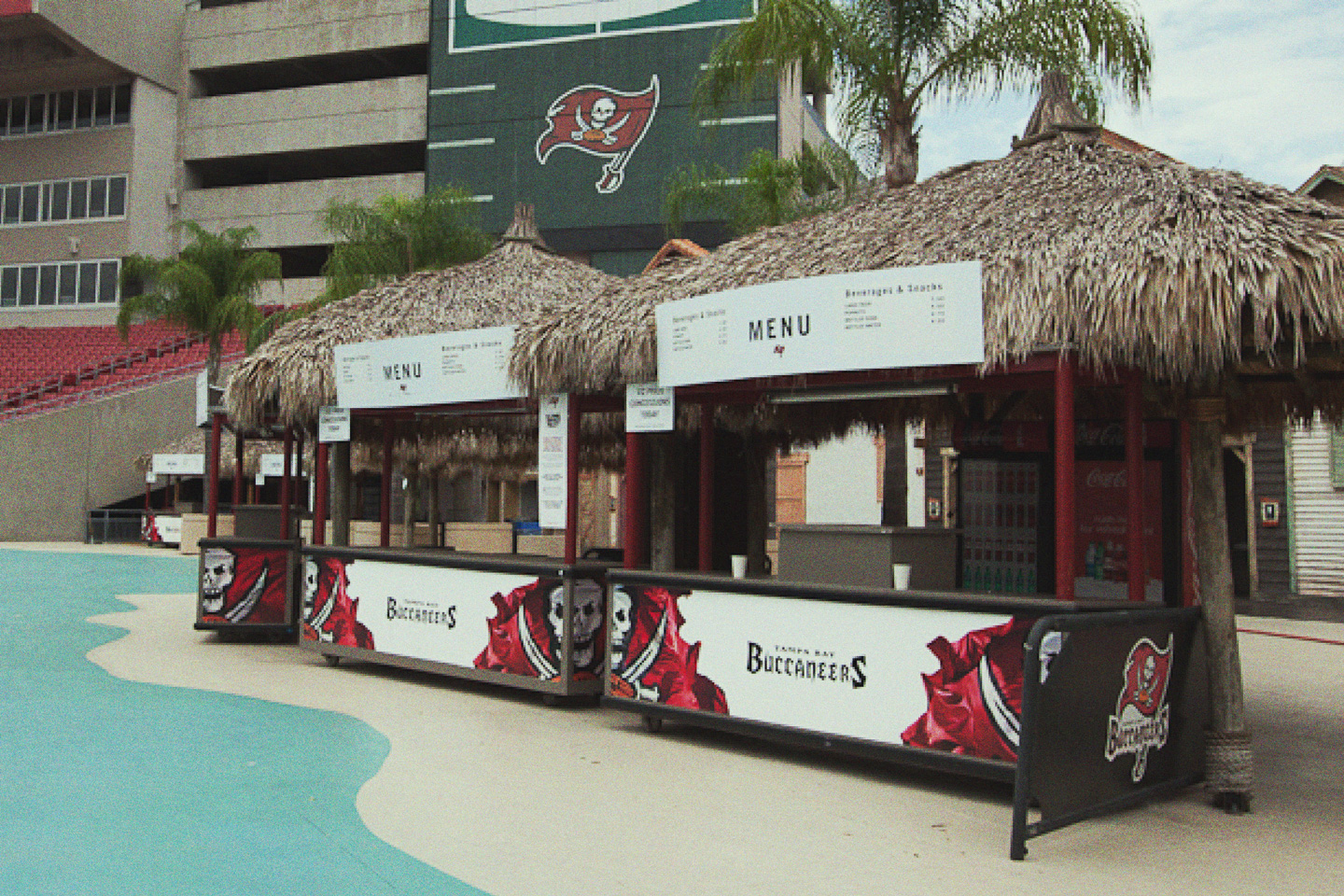
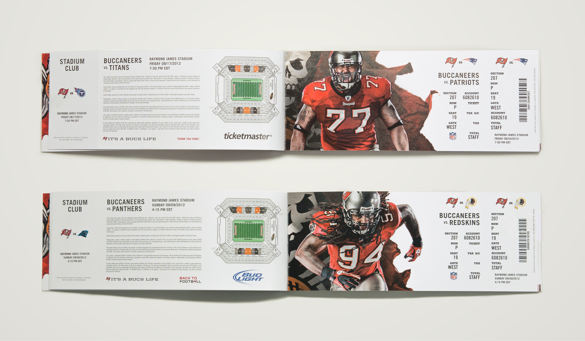
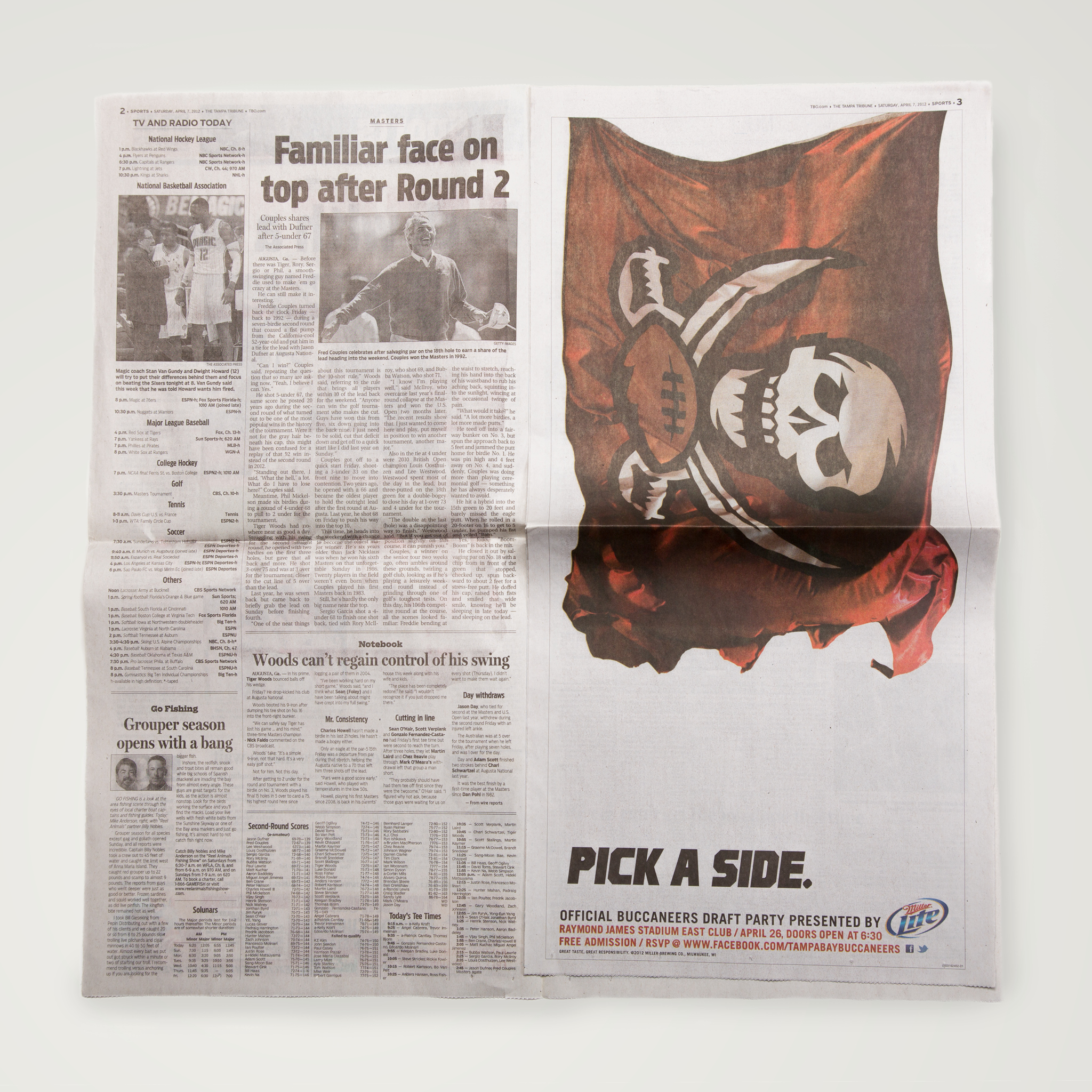
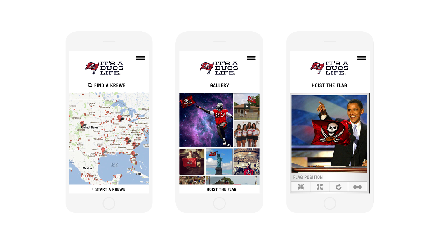
We also revamped the ticketing experience and created a new print, out of home, social media and television campaign, supported by a refresh of Buccanners.com and a slew of microsites.
Ultimately—this didn't help them win any Super Bowls, but the franchise went from dead last in fan engagement and overall experience to number three in the entire NFL. Go Bucs!
︎
Made for:
Tampa Bay Buccaneers at Mutt Industries
Athlete Photography / Stadium Signage / Ticketing Experience / Branding / Strategy / Digital / Out-of-home / Advertising
My role:
Art direction, design lead, website strategy and design, photo retouching.
︎
With:
Creative: Steve Luker, Mike McCommon, Scott Cromer, Aaron James, David Zavertnik, Al James, Nikolaus Drellow
Design: Emma Barnett, Willyum Beck, Claiborne Colombo
Photography: Shaun Mendiola
Design: Emma Barnett, Willyum Beck, Claiborne Colombo
Photography: Shaun Mendiola
︎
Some more work ︎